Custom broadcast grid system developed for RTP news graphics, mapping the spatial structure for promos, lower thirds, channel ID, banners, ticker, and sign language placement.

Broadcast Design · Motion System

RTP | Infographics

  • Art Direction
  • Broadcast Design
  • Infographics
  • Graphic Design
  • Motion Graphics

The Challenge

When Portugal’s leading public broadcaster set out to reinvent the way it delivers news on-screen, they chose us to lead the transformation — from rebranding all news shows to building a powerful motion system that became part of RTP’s signature identity.

RTP (Rádio e Televisão de Portugal) commissioned Itsanashow Studio to lead the full rebrand of its national news programming. This meant crafting not only the visual identity for every news segment, but also designing a complete, scalable infographic system tailored for real-time, live broadcast.

Our challenge?

To translate complex data into fast, intuitive visuals. To balance expressive design with editorial rigour. And to build a cohesive, motion-driven language that would adapt across a vast array of content — from breaking news alerts to sports results, economic indicators to weather forecasts.

Modular infographic table for RTP news broadcasts, designed as a semi-transparent overlay to present comparative data over live footage or background imagery, optimized for legibility and editorial clarity in motion graphics.Broadcast infographic panel for RTP news, structured to present key statistics and display multiple data sets side by side for visual comparison and editorial clarity in a modular layout.Line chart infographic designed for RTP news broadcasts, used to display time-based data evolution with dynamic visuals optimized for motion graphics and editorial storytelling.Pie chart infographic for RTP news broadcasts, designed to visually segment data using distinct color-coded slices, optimized for editorial clarity and on-screen legibility in motion graphics.Quote overlay infographic for RTP news broadcasts, designed to highlight key statements over web content or digital platform layouts, optimized for editorial storytelling and broadcast legibility.
Quote overlay infographic for RTP news broadcasts, designed to highlight key statements over thematic imagery when no digital platform is available, ensuring editorial consistency and broadcast-ready legibility.Text highlight graphic for RTP news broadcasts, designed to emphasize key excerpts from documents, newspapers, or books, using color overlays to enhance editorial storytelling and viewer engagement.Quote card infographic for RTP news broadcasts, featuring a statement from a person or institution with a left-aligned photo or logo, and a thematic or generic background, optimized for editorial storytelling and visual balance on screen.Infographic over-the-shoulder social media quote used in RTP broadcast to highlight statements from public figures or institutions. Includes background image or footage for contextual relevance, a quote box styled with a social media reference (in this case, Twitter), name, role, handle, and relevant hashtags used.Infographic social media highlight for RTP segment featuring notable quotes or posts from public figures, organizations, or companies. Includes a background image illustrating the topic, a profile photo of the person or entity, their name, role, and username.Infographic using satellite imagery (Google Maps) to illustrate location and path in RTP's breaking news segment. Highlights key landmarks such as Avenida da Liberdade and Hard Rock Café in Lisbon, with overlaid route line and custom RTP graphic system for clarity and real-time news updates.Alert infographic (warning map) for RTP broadcast, displaying a color-coded map of Portugal and its autonomous regions (Azores and Madeira) to indicate the severity of a national emergency situation. In this example, Storm Glória highlights high-risk districts such as Viana do Castelo, Braga, Porto, and Vila Real in red. Includes affected locations, risk legend, and source (IPMA).Geopolitical context map infographic used in RTP news segments to illustrate locations relevant to international events. This example highlights Vilnius (Lithuania) and Minsk (Belarus) in the context of presidential elections and political unrest. A key innovation is the inclusion of a small locator map positioned above the lower-third, providing a zoomed-out view of Europe to quickly situate the highlighted countries. This visual aid enhances geographic clarity and helps viewers grasp the global context more intuitively.Seismic alert infographic for RTP's news coverage, used in breaking news segments. Highlights the epicenter and affected area of an earthquake with concentric rings for impact range, clearly labeled nearby cities, and precise distance markers. Includes a secondary locator map above the lower-third (oráculo) to provide wider geographic context — a subtle but innovative touch to improve audience understanding at a glance.Economy panel infographic for RTP news broadcasts, presenting real-time stock market data with directional arrow icons and color-coded performance indicators, designed for clear visual communication and editorial clarity on screen.Broadcast infographic panel for RTP news, featuring PSI 20 index performance and key national stock variations, with real-time percentage changes, value highlights, and color-coded directional icons for visual clarity and market analysis.Broadcast infographic line chart for RTP news, comparing inflation rates over two years with monthly data points and a dual-line structure for clear economic trend analysis.Broadcast infographic panel for RTP news, presenting international oil price comparison between Brent and Light Crude benchmarks, with dynamic visual cues for up and down trends, designed for economic news coverage.Broadcast infographic panel for RTP news showing the ISEG index used to track economic activity, with visual indicators of growth or decline and contextual data for the corresponding month.Broadcast infographic table for RTP news showing fuel prices, including gasoline, diesel, and gas, with arrows and color indicators to highlight price changes and market trends.Over-the-shoulder broadcast graphic for RTP news displaying Portugal’s inflation rate in January 2021, with highlighted percentage and trend indicator over a cityscape background, designed for editorial financial updates.Over-the-shoulder broadcast infographic for RTP news showing oil prices for Light (New York) and Brent (London) barrels, designed for on-screen presentation with urban backdrop and clear value indicators.Broadcast pie chart infographic for RTP news, illustrating private capital financing sources using a color-coded segmentation for editorial data visualization. Designed for clarity and fast audience comprehension.Bar chart infographic for RTP news, displaying the evolution of the inflation rate across the second semester of 2020. Designed for broadcast use with dynamic data visualization and color-coded emphasis on key values.Infographic player card for RTP sports segment featuring Cristiano Ronaldo. Created to display the athlete profile, which includes portrait photo, club and nationality, age, height, and detailed statistics such as number of matches, goals, assists, and minutes played.Infographic matchday scoreboard for RTP sports segment displaying fixtures for the selected league — featuring the competition logo for quick identification — and matchday number or game dates, in this case Primeira Liga Jornada 12. Includes club logos, team names, and score results for each match, structured in a clean, symmetrical grid layout.Infographic showing the match result, displaying team logos, names, final score, and the league or championship logo for contextual reference. Illustrated with a match between S.L. Benfica and S.C. Sporting in the Primeira Liga.Infographic leaderboard table for RTP sports segment showing the standings of each club, using Primeira Liga as example. Includes ranking, team logos, names, number of games played, and total points.Infographic lineup formation with player headshots for RTP sports segment, displaying each athlete’s profile photo, name, field position, national team or club logo, team name, and coach.Infographic lineup formation for RTP sports segment showing the starting eleven, player positions on the field, club logo, player names, team name, and coach.

The Solution

A flexible broadcast design system powered by motion clarity, brand storytelling, and editorial precision.

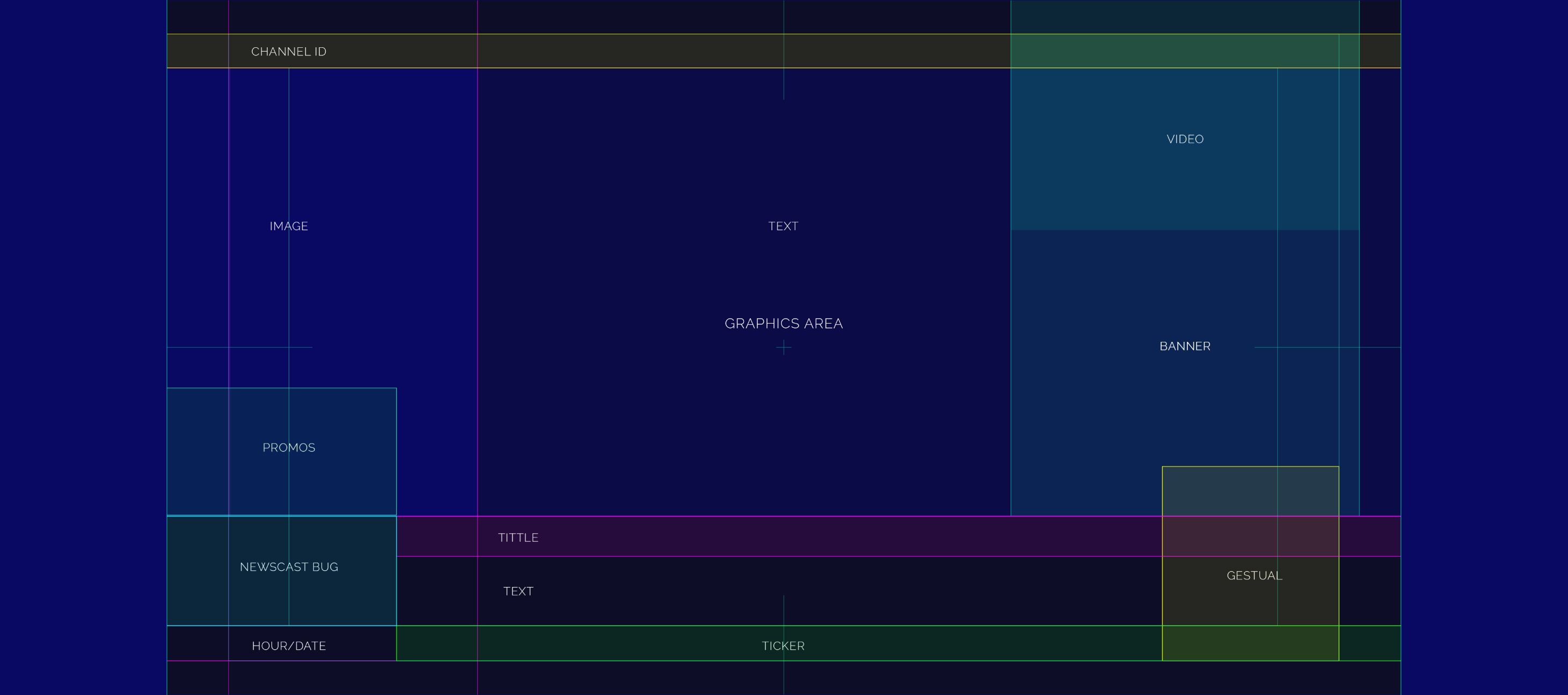
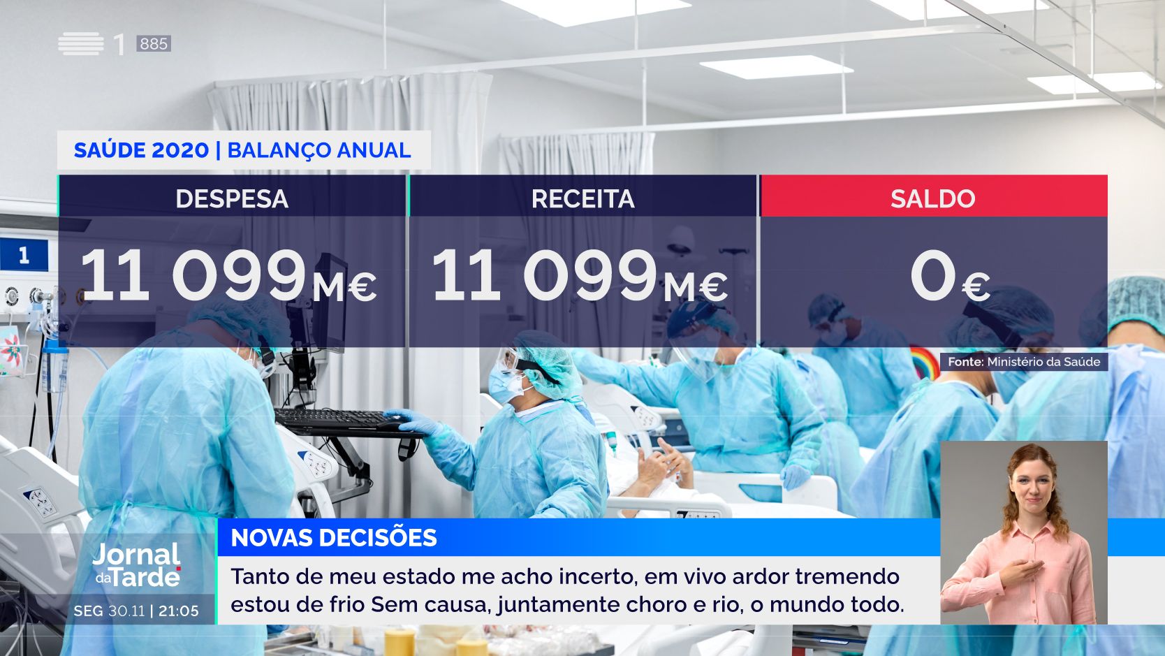
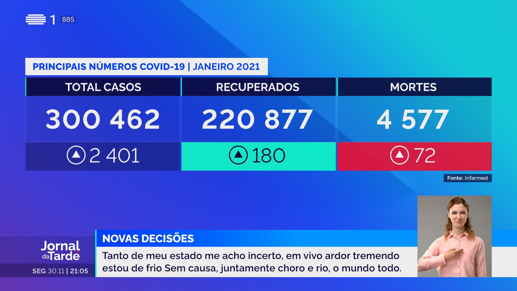
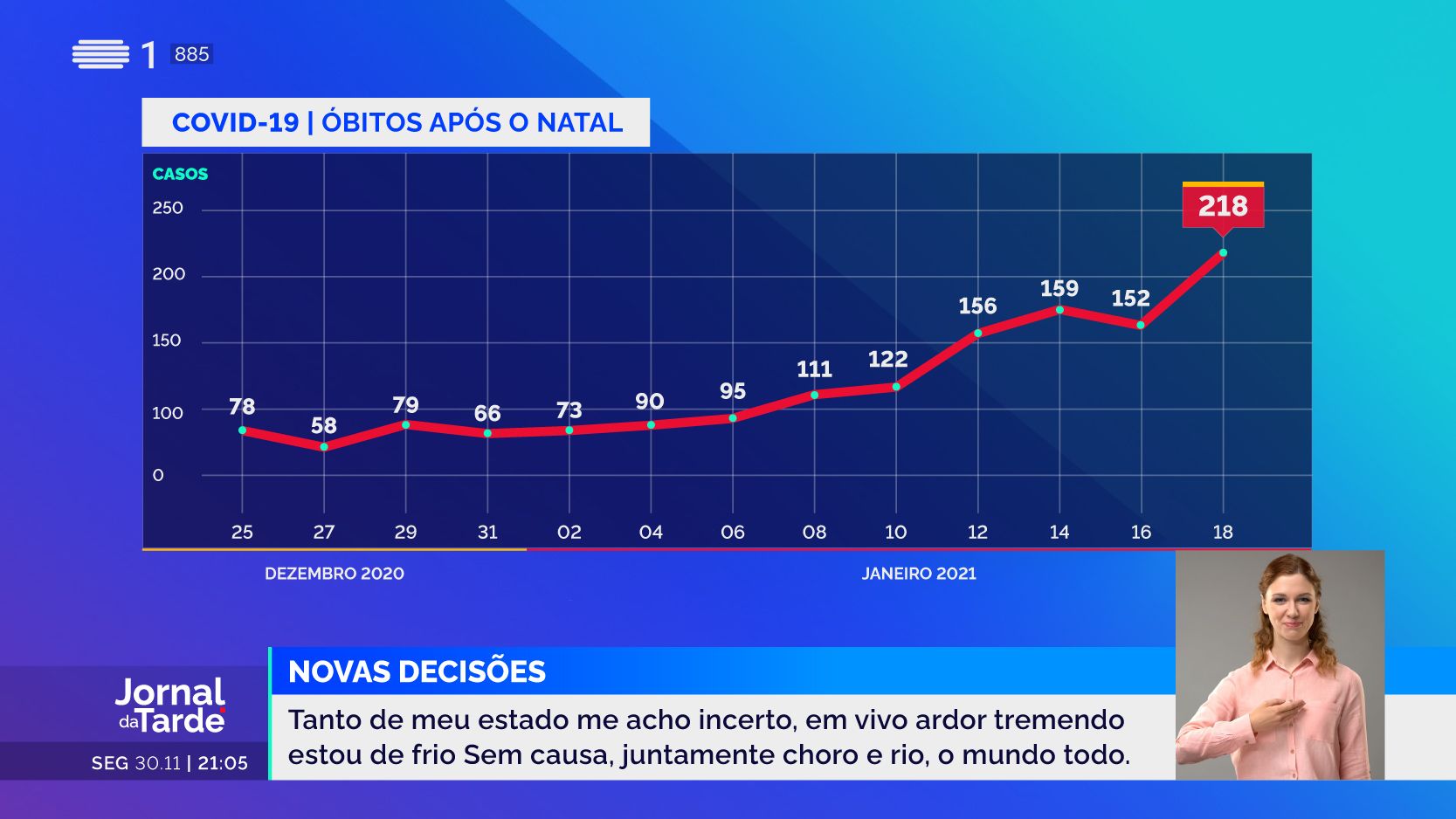
We designed a modular, broadcast-first infographic system that brought clarity, speed, and brand distinction to RTP’s daily newsroom output — all through the lens of motion branding.

🔹 Motion as Identity
We didn’t just animate the news — we built a motion language. Every transition, timing, and rhythm was purposefully designed to match RTP’s editorial tempo, transforming animation into a key pillar of its on-air identity.
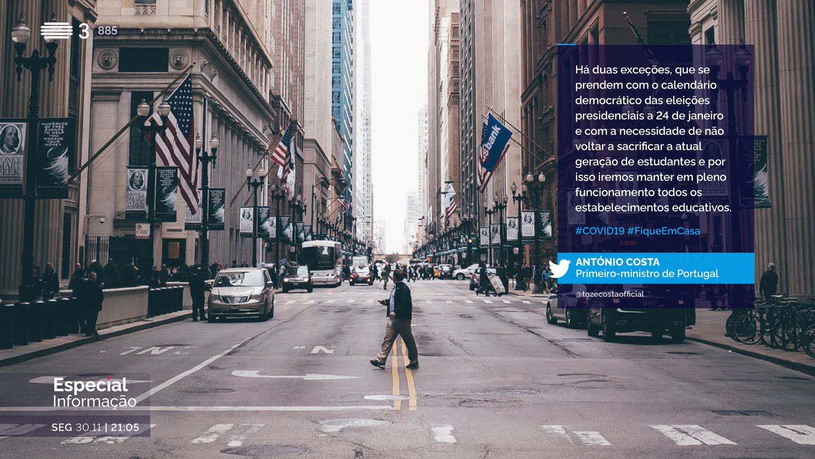
🔹 Color That Speaks
We implemented a smart color-coded system aligned with RTP’s rebrand. Each news outlet was assigned its own palette — enhancing navigation, visual hierarchy, and recognizability across all platforms.

🔹 Minimalist, Light-Emitting Icons
Our weather icons and visual assets were designed with clarity in mind: minimalist, glow-accented, and fully optimised for screen legibility. Inspired by the light-based brand principles we defined for RTP, these icons radiate information at a glance.

🔹 A System Built for Scale
From high-impact templates to micro-level UI, every component was designed to be modular, adaptable, and newsroom-friendly — enabling fast, consistent storytelling without compromising on brand experience.


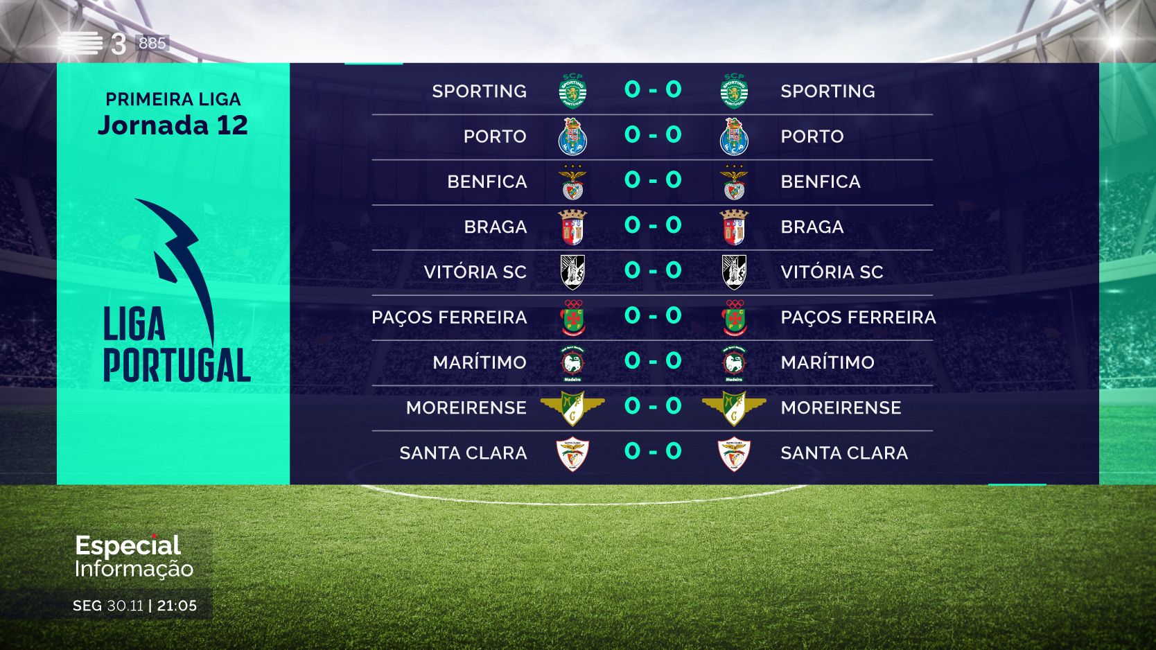
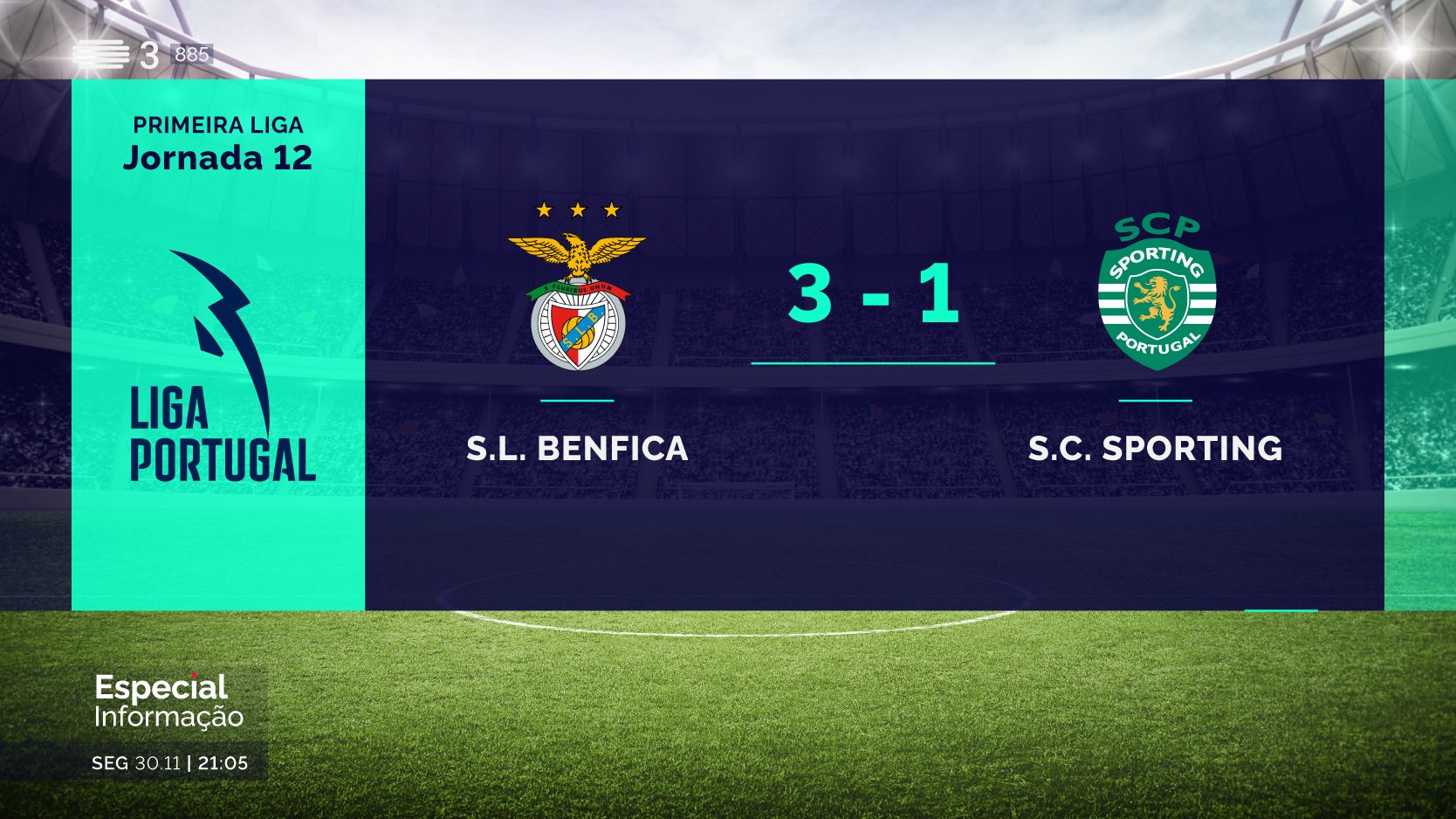
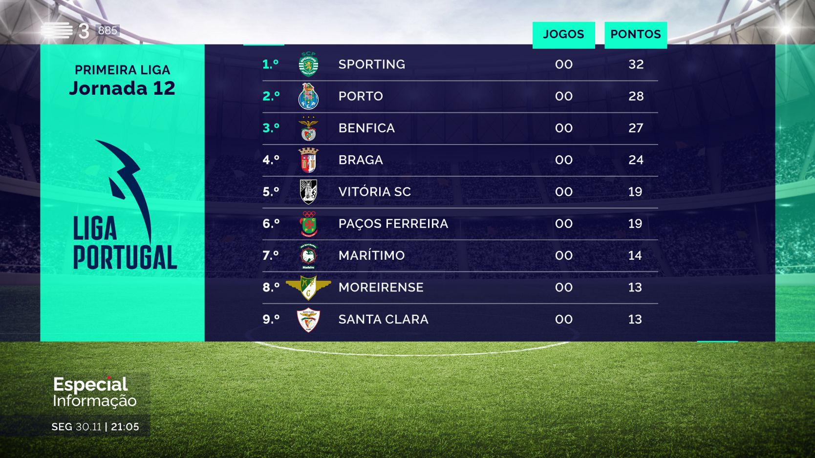
Broadcast Design Deliverables
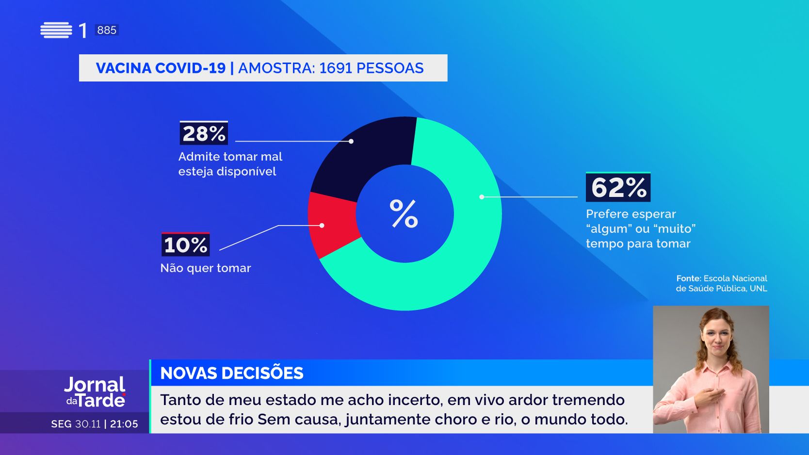
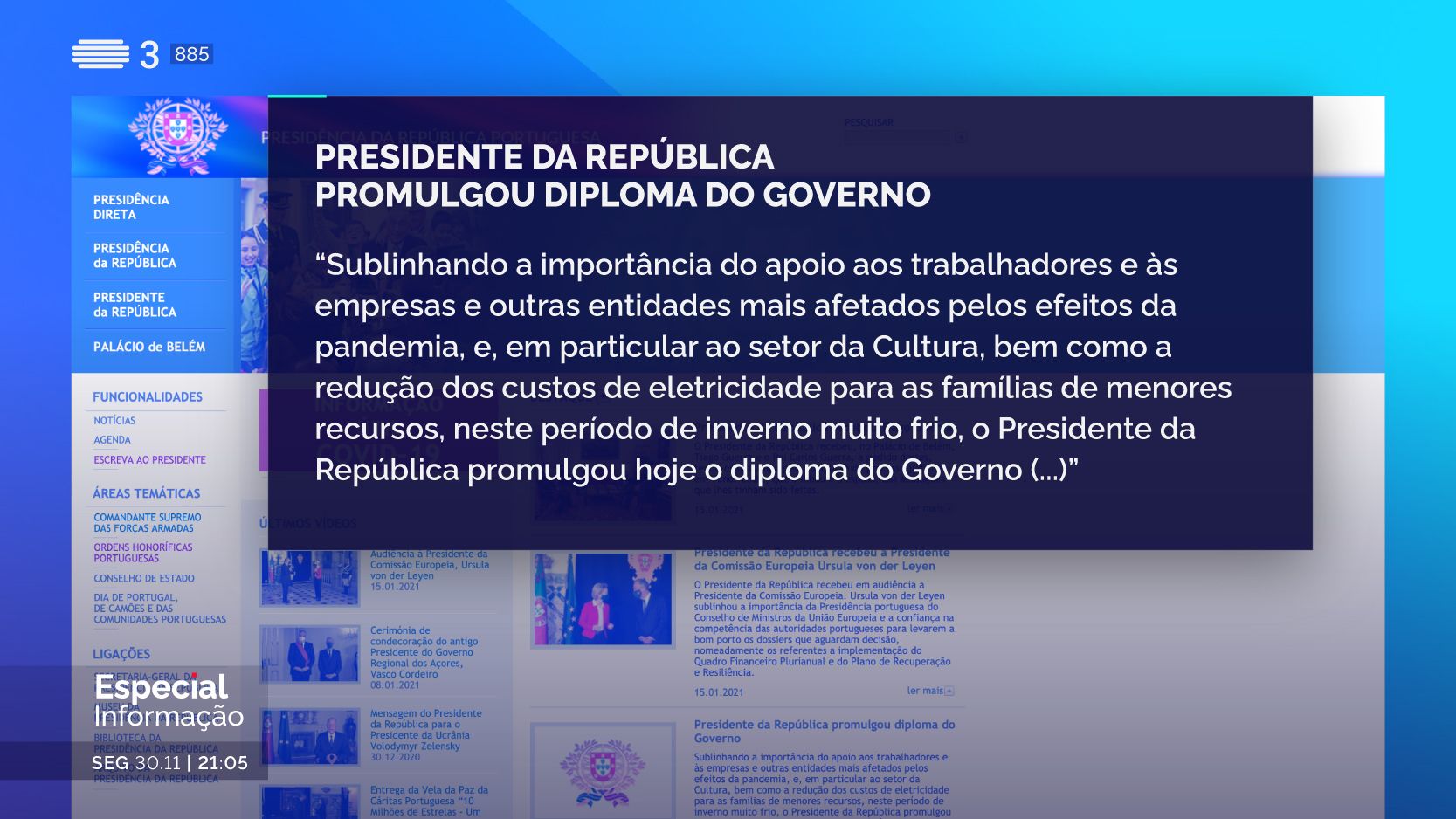
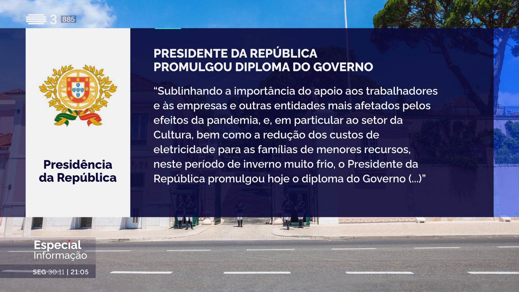
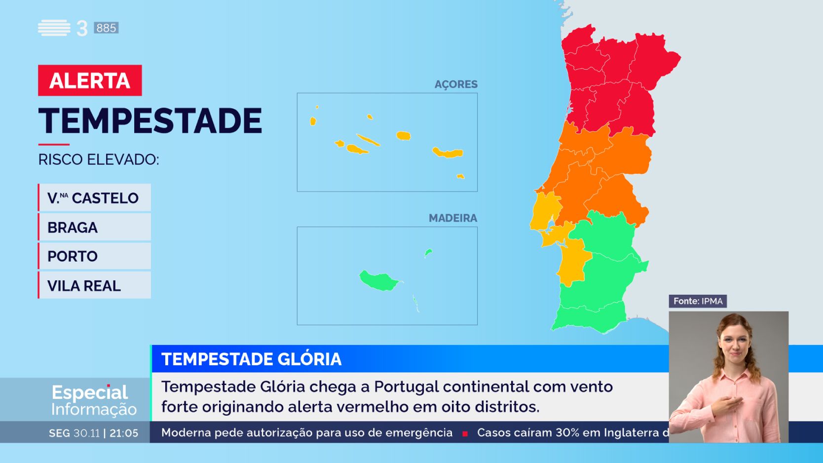
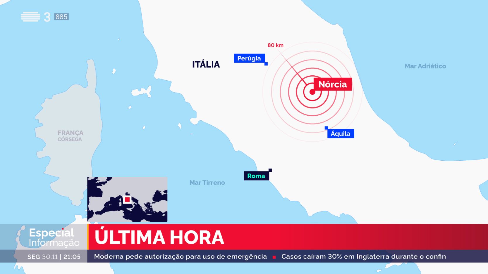
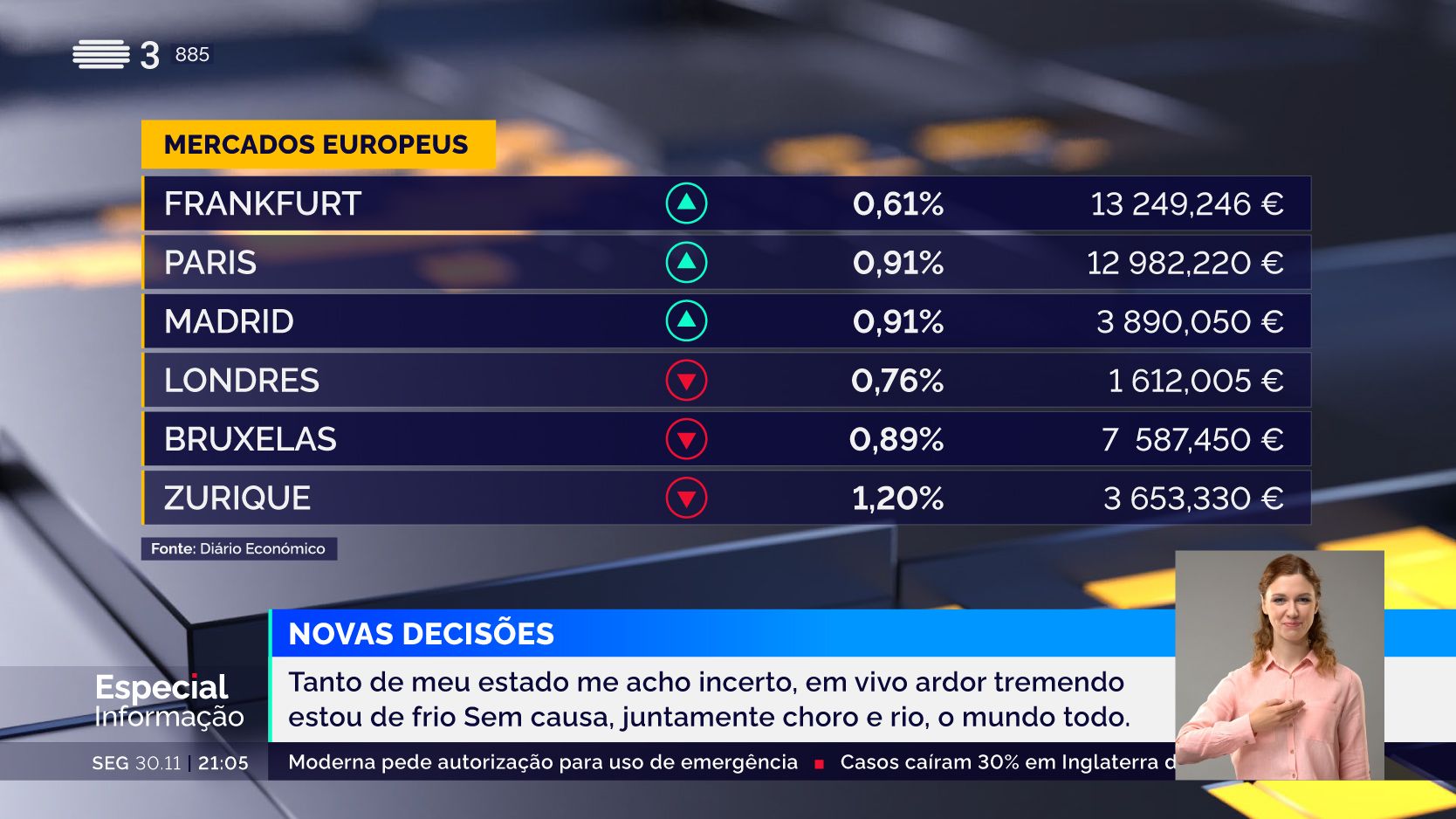
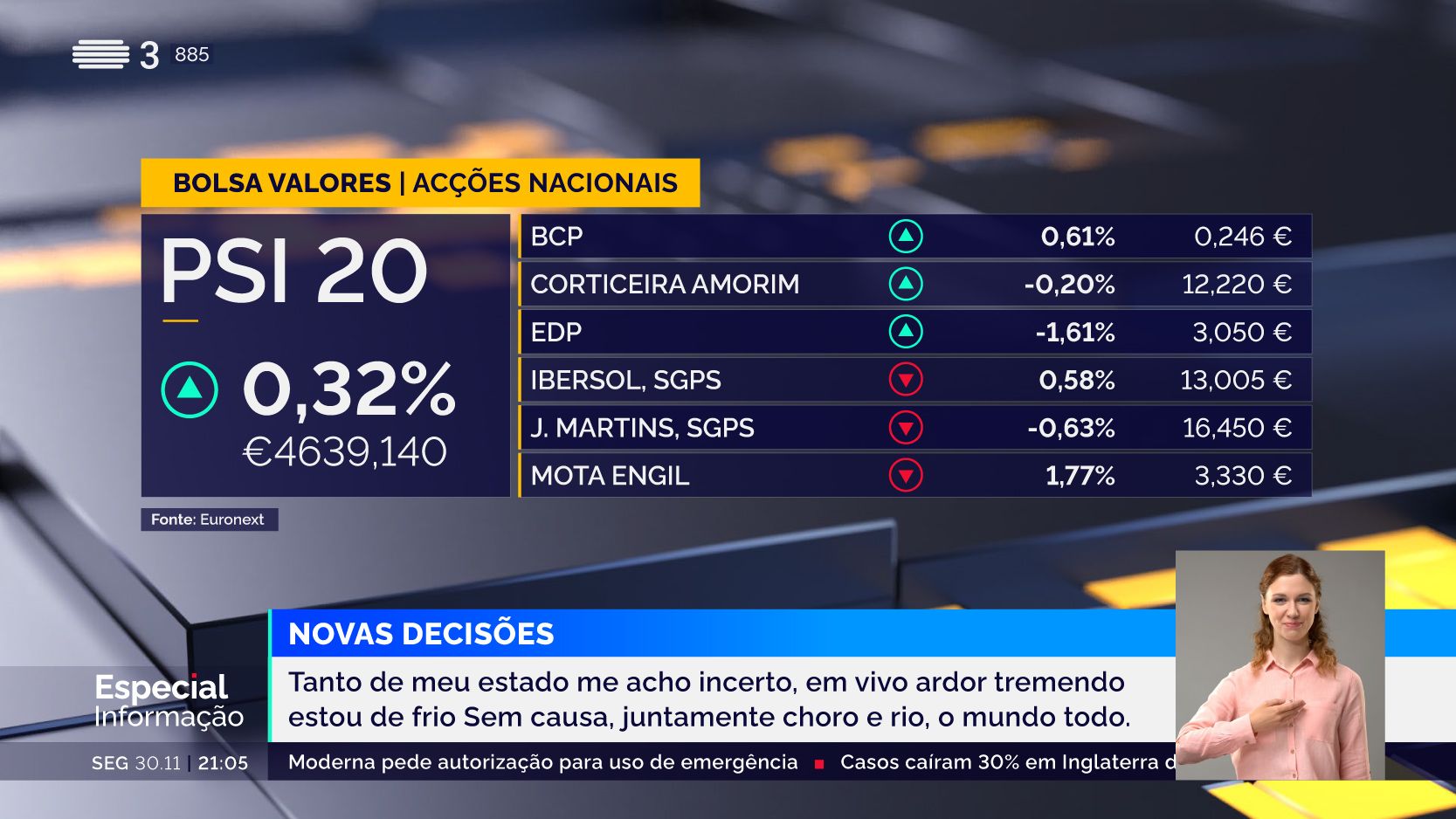
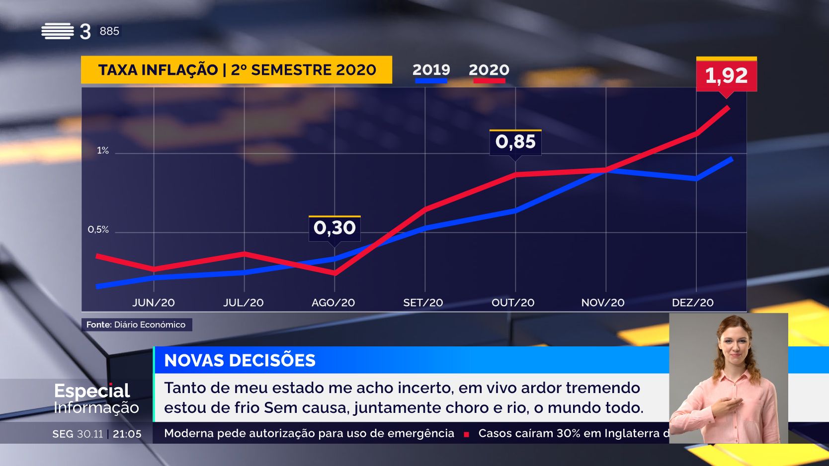
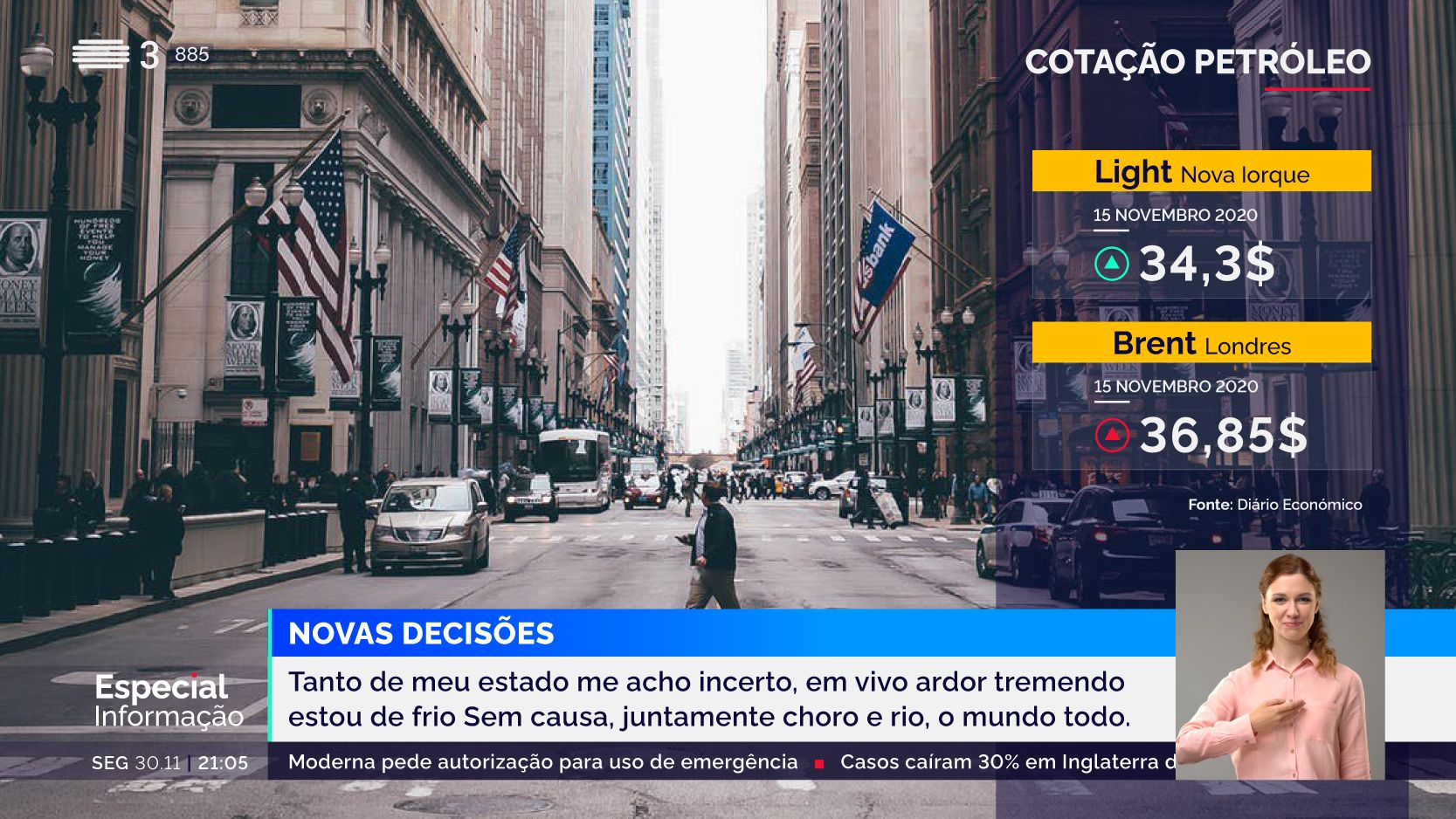
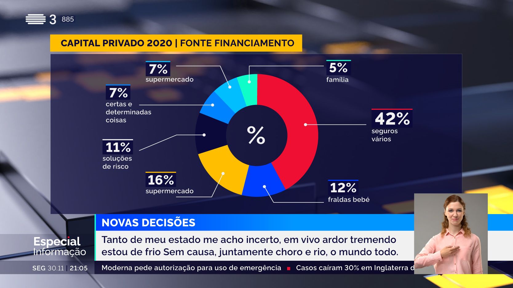
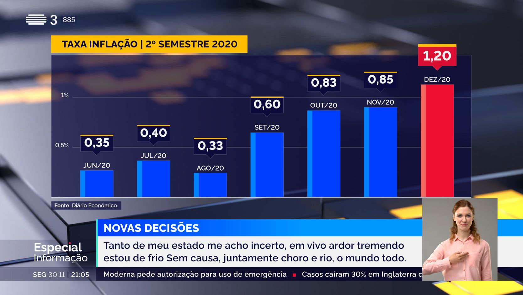
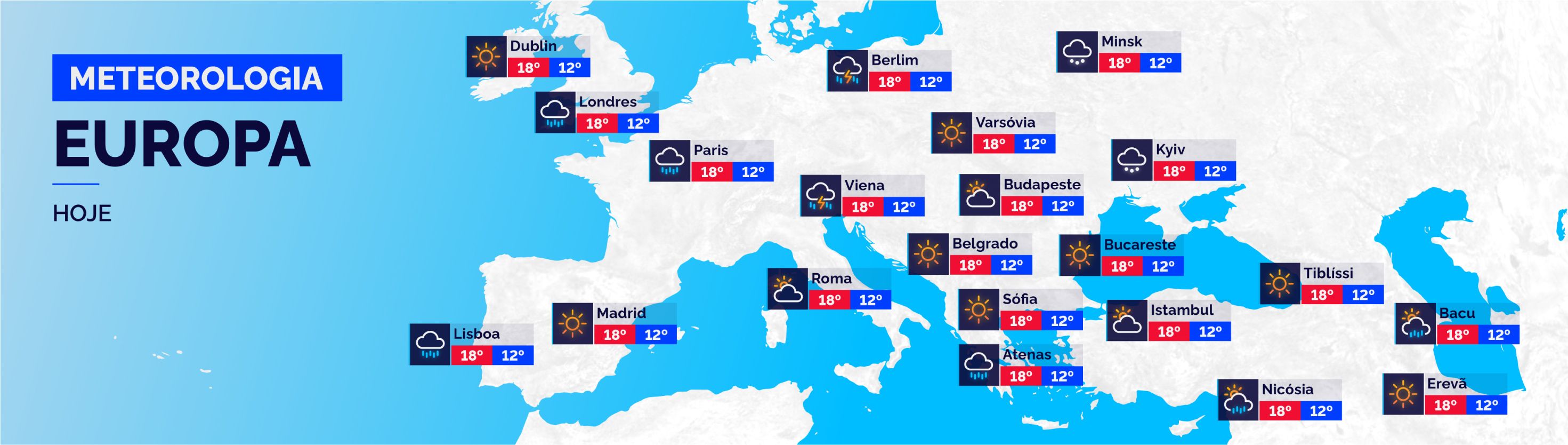
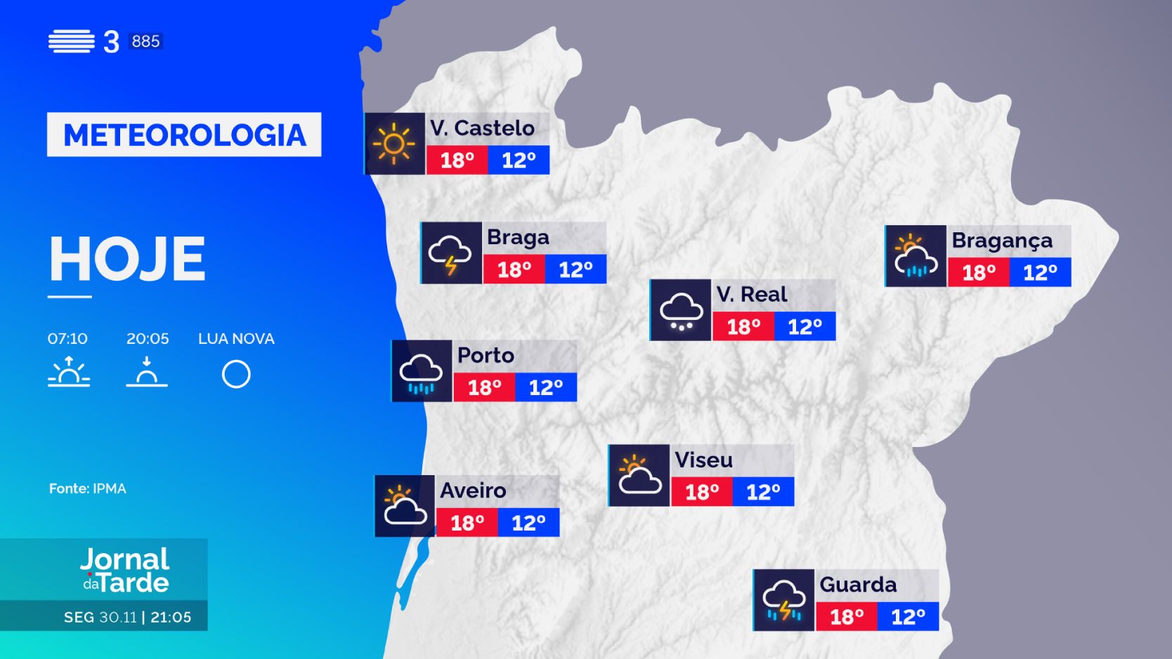
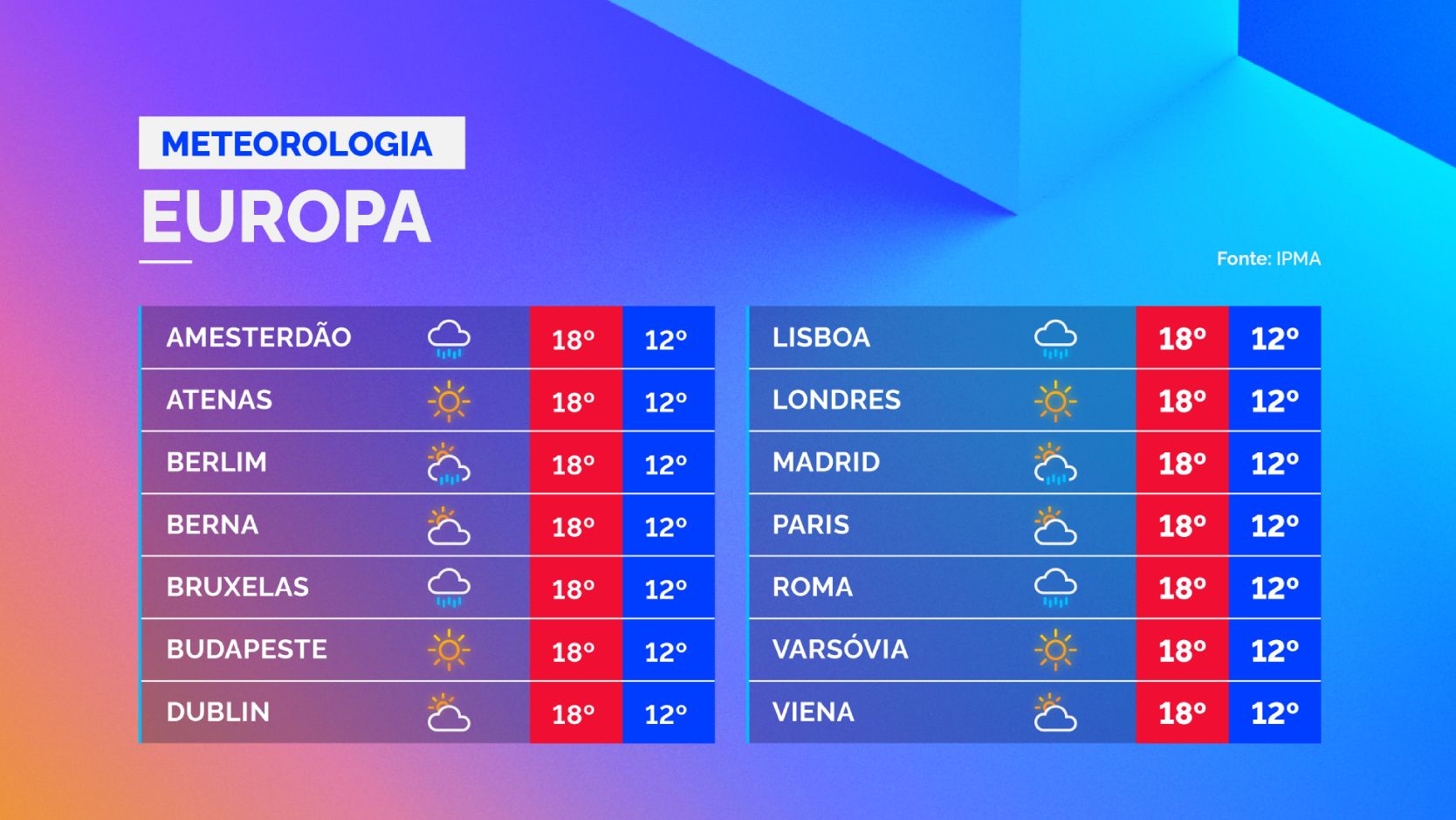
  • 45+ custom infographic templates spanning news, sports, economy, and weather
  • 12 animated weather icons with light-reactive details
  • 4 forecast formats: national, international, LED wall, and global cities
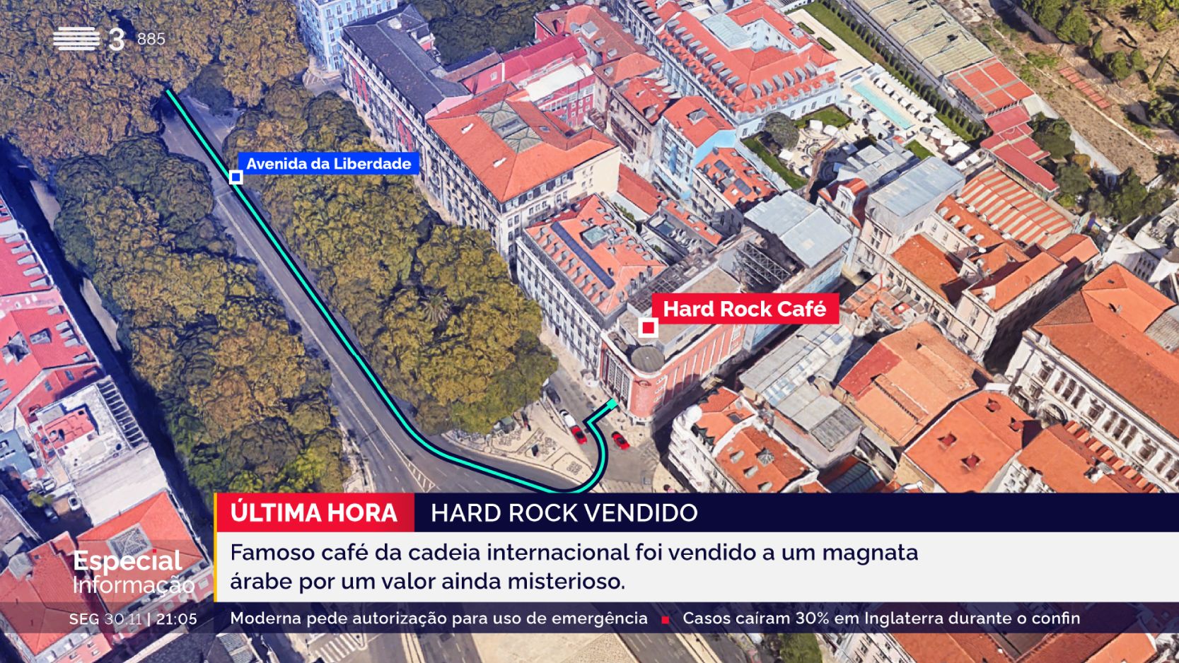
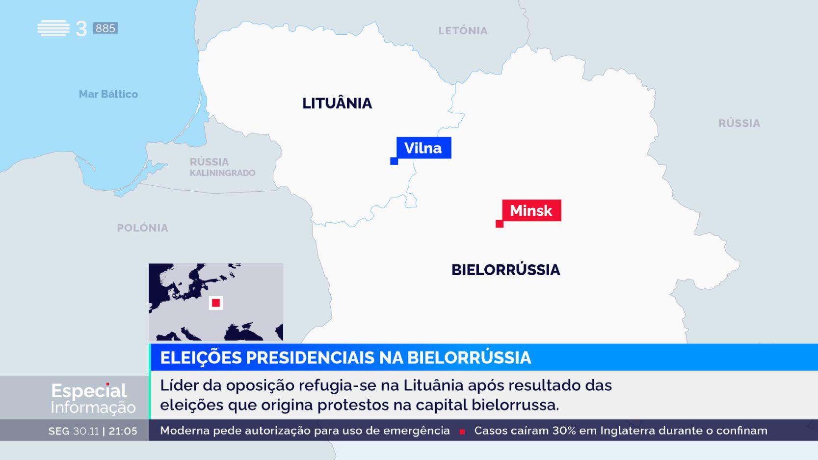
  • 4 map-based designs for alerts, locations, and routes
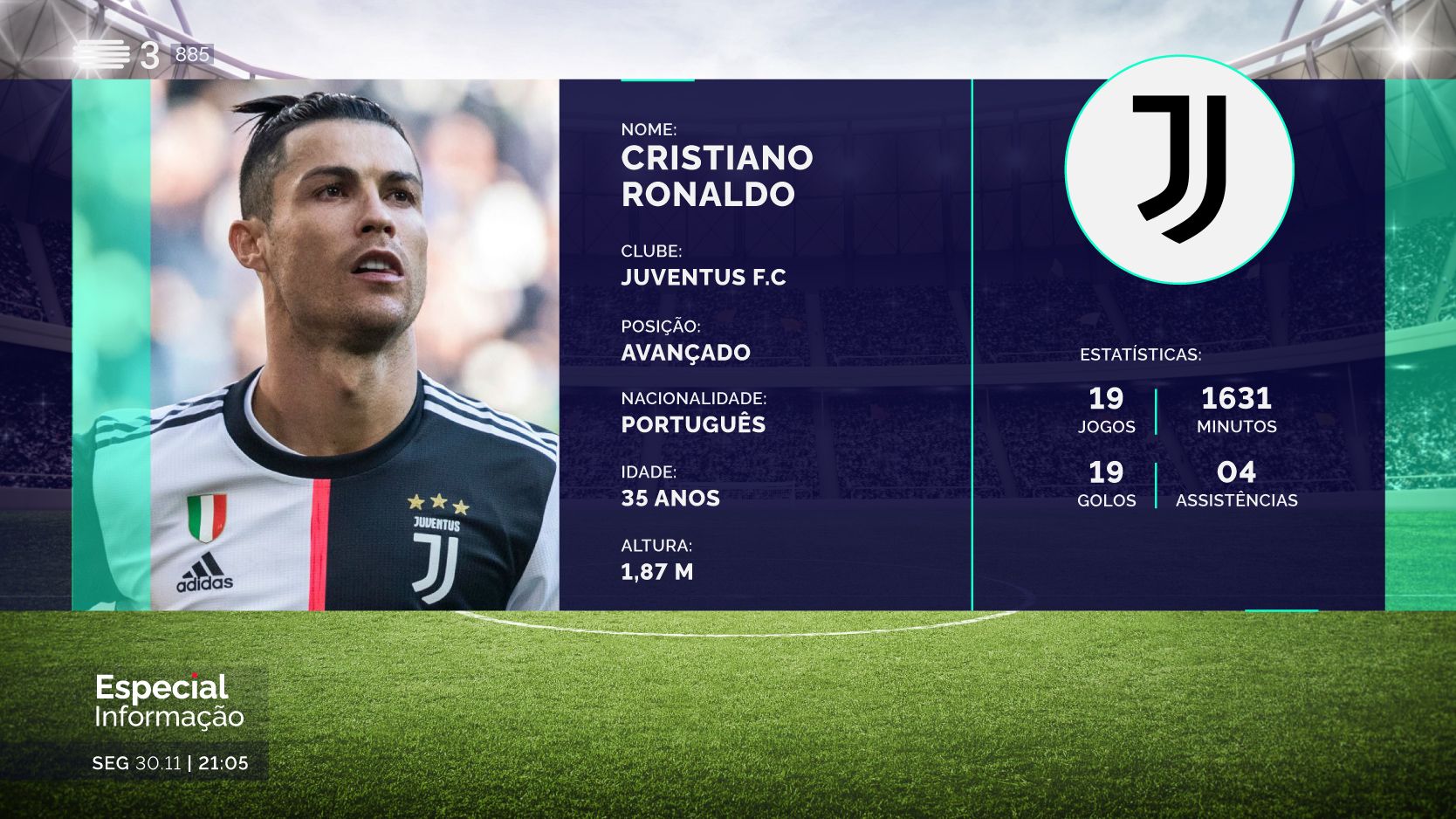
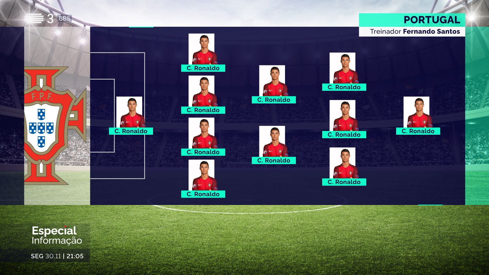
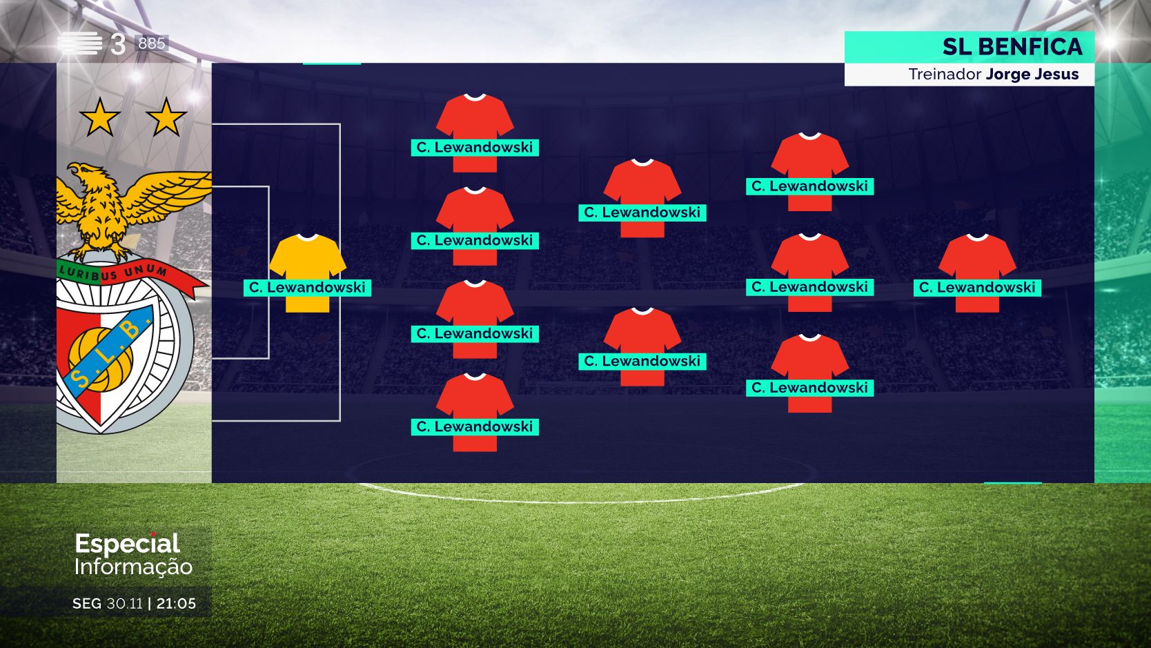
  • Dedicated graphics for match results, team formations, rankings, and player profiles

Impact

The system became a visual signature of RTP’s rebrand — aligning editorial clarity with a strong motion identity. It empowered broadcast teams with tools that are fast to operate and intuitive to use, while elevating the audience experience through visuals that are bold, consistent, and unmistakably RTP.

Whether it’s a live news segment or a full-scale rebrand, we build motion systems that turn screens into statements.


👉 Explore the complete breakdown of this project:
Weather forecast infographic for RTP's meteorology segment, displayed on the LED wall and presented by the IPMA meteorologist. Shows today's weather forecast across European capitals, with our custom RTP weather icons, high and low temperatures, and clear city labeling. Designed for quick visual reference and wide on-screen readability.
National weather forecast infographic for RTP’s meteorology segment, showing today’s conditions across Portugal's North, Center, South, Madeira, and Azores regions. Includes RTP's custom weather icons, high and low temperatures, sunrise and sunset times, and current moon phase — an innovative addition in this type of infographic.Weather forecast infographic for RTP2 showing today's temperatures and conditions for major cities across all continents. Includes custom RTP weather icons, high and low temperatures, and clear city labeling, designed for straightforward visual scanning and global coverage.

I am very satisfied with the work we developed together. The feedback was excellent, and we achieved sobriety, elegance, and readability.

António José Teixeira

News Director at RTP

Design grid of RTP’s custom weather icons for broadcast use. Developed within a minimalist, outlined visual system, the icons follow a light-driven design language with subtle glow effects that enhance legibility and brand consistency on screen.Animated set of weather icons created for RTP’s on-air meteorology graphics. Each icon features a smooth glow and fluid transitions, reinforcing RTP’s light-based branding while ensuring clarity and impact in real-time broadcast environments.

Ready to start yours?
Your story could be next.